What Colors Photograph Best Outdoors
Color is one of the very few parts of a portrait you get to decide completely before we ever begin. The breeze, your toddler's mood, the way the light falls — those are mine to manage on the day. But the colors you and your family wear are entirely yours, and they shape the feeling of your images more than almost anything else people think to plan for. So when the quiet what should we wear worry starts circling — and for most people it does — I would start with color, because it carries more of the picture than you would guess.
Most of my sessions happen where families are most at ease: in their own homes, photographed in the soft natural light coming through the windows, and out in the gardens, neighborhood parks, and shaded patios around Palm Desert, Rancho Mirage, La Quinta, and the wider Coachella Valley. So I want to give you the honest, practical version of this — not a generic list, but what genuinely photographs best here, whether we are in your living room or stepping outside into that famous warm desert light.
Why color matters more outdoors than indoors
Indoors, we control the background — a quiet wall, a window, the corner of a room that means something to your family. Step outside and your backdrop is suddenly alive and already full of color, and around here it has a very specific palette: the warm tans and dusty golds underfoot, the soft sage and silver-green of desert plants, the greens of a watered garden or a park lawn, the pale washed blue of the sky, the deep shadows of the San Jacinto and Santa Rosa mountains at dusk. Whatever you wear is going to sit inside that palette, not against a blank wall.
The goal is harmony. When your clothing colors live in the same family as the landscape, your eye glides through the photograph and lands where it should — on your faces, your hands, the way your daughter is leaning into you. When the colors fight the landscape, the photo feels busy and your clothes start doing the talking instead of you. So the real principle behind "best colors for outdoor photos" is simple: choose colors that belong to the place.
The colors that photograph best in the desert
After hundreds of sessions out here, these are the shades I reach for again and again when clients ask.
Soft neutrals and creams
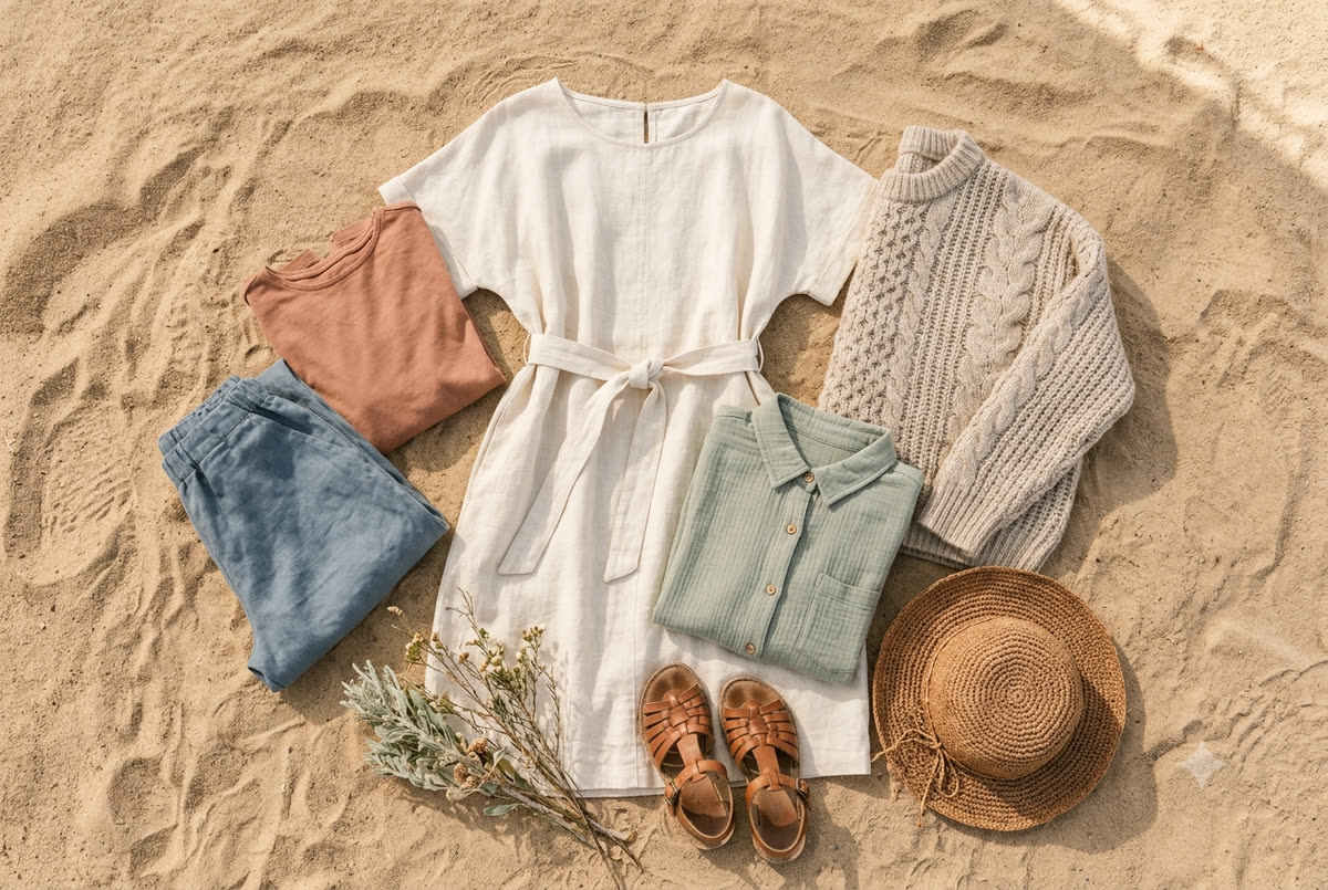
Ivory, oatmeal, soft white, warm beige, taupe, camel. These are my desert workhorses. They catch the golden hour light beautifully, they never compete with your skin tone, and they feel timeless — you will not look at these images in ten years and date them to a trend. Neutrals also do something subtle and lovely: they let you be the brightest, most saturated thing in the frame, which is exactly where I want the viewer's attention.
Earth tones
Terracotta, rust, clay, ochre, warm browns, olive and sage greens, muted mustard. If neutrals are the foundation, earth tones are the heart of desert color. They echo the warm ground and the plant life directly, so your family reads as part of the setting rather than pasted onto it. A rust-colored dress among the greens of a shaded garden at golden hour is, to me, close to perfect.
Dusty, muted, and "dusted" colors
This is the most important word in this whole article: muted. A dusty blue, a faded sage, a soft mauve, a clay pink, a washed terracotta — these all photograph wonderfully because the desert itself is muted and sun-softened. Color that looks like it has a fine layer of warm dust over it will always sit more peacefully in these images than a bright, pure version of the same hue.
Soft, warm jewel tones (used gently)
You do not have to live entirely in neutrals. A muted emerald, a dusty navy, a deep terracotta-red, a soft plum can give a portrait richness and a little drama, which can be gorgeous for couples or a more elevated family look. The trick is to keep them deep and slightly desaturated rather than electric, and to let one person wear the color while the others stay in supporting neutrals.
Colors to be careful with — and why
I never want to hand anyone a list of "forbidden" colors, because the right photographer can make almost anything work. But honesty is more useful than rules, so here is where people most often run into trouble out here.
- Pure, bright white. It is so easy to reach for, but in our intense desert sun a crisp white top can blow out to a glowing white shape that pulls the eye and loses all its detail. A warm cream or ivory gives you the same fresh, light feeling with far more grace under our light. (More on this in what to wear for a desert family session.)
- Neon and highly saturated brights. Hot pink, electric blue, bright lime, traffic-cone orange. These colors are wonderful in life and very loud in a photograph. They also cause color cast — bright fabric bounces its own color up onto the underside of your chin and neck, so a neon shirt can quietly tint your skin. Against muted desert tones the effect is jarring.
- Logos, large slogans, and busy graphics. Color and text both compete for attention. In ten years you want to see your child's face, not the cartoon on the t-shirt.
- Tight, small, repeating patterns — thin stripes, tiny checks, fine herringbone. These can shimmer and buzz in a digital image (it is called a moiré pattern) and they rarely photograph as cleanly as they look in person.
- All black, head to toe, in bright open sun. Black can be sophisticated, and I love it in the right setting, but in strong direct light a fully black outfit can flatten into a detail-less silhouette. It does far better indoors by a window, in open shade, or at dusk.
Build a palette, not a uniform
One thing I gently steer families away from is the matching outfit: everyone in the same white top and the same jeans. It comes from a loving instinct, but it tends to make a portrait feel like a team photo and flattens everyone's individual personality into one block.
What you want instead is a palette, not a uniform. Pick two or three core colors plus a neutral, and let everyone pull from that range in their own way. A good desert example: warm cream, sage green, and rust. Mom in a flowing cream dress, Dad in an olive button-down, one child in a rust romper, another in soft cream with a sage detail. Everything belongs together, nothing matches exactly, and each person still looks like themselves.
A few coordination habits that always serve my families well:
- Start with the hardest person to dress — usually a teenager or a particular little one — find something they will actually wear and feel good in, then build the rest of the palette around that.
- Spread your tones around the group so one color is not stranded on a single person. If someone is in terracotta, let another person carry a small echo of warm rust or a complementary cream.
- Layer and add texture. A linen shirt, a knit cardigan, a gauzy dress, a denim jacket, a felt hat — texture reads as richness in a photograph and adds depth even within a quiet color palette.
- Mind the feet. Shoes are part of the picture, especially when we are wandering a park path or sitting together on a lawn or a patio.
Let the season and the light guide you
The desert is not one place all year, and the calendar should nudge your palette.
The cooler months, roughly late fall through spring, are when outdoor sessions are easiest — the light is soft, the temperatures are kind, and golden hour stretches out generously. This is prime time for the full earth-tone and neutral palette. Cooler dusty tones like sage, dusty blue, and soft mauve feel especially right against the clearer winter sky and the low warm sun.
Spring brings the occasional wildflower bloom and a brief flush of green, which can be a beautiful moment for soft pastels — clay pink, butter yellow, pale sage — that pick up the seasonal color without shouting over it.
Summer is its own animal. From roughly June through September the heat is serious, and I schedule those sessions right at sunrise or in the last sliver of light before dusk. We are dressing for breathable comfort — light linens and loose cottons in pale creams, sand, and the softest earth tones, which also happen to reflect heat better than dark colors. Function and beauty agree here.
And always, golden hour is the great equalizer. In that warm, low, honey-colored light an hour before sunset, nearly every muted and earthy color glows. It is forgiving and flattering, it wraps warm tones in even more warmth, and it is exactly why I plan so many desert sessions around it. If you want to understand why I am so particular about session timing, I wrote more about that in the best time of day for photos in the desert.
A simple desert palette that always works
If you would rather not overthink any of this — and many people would rather not — here is a formula I would happily put my name on for almost any Coachella Valley family session:
- One soft neutral as your base — cream, oatmeal, or warm beige.
- One earth tone — terracotta, rust, olive, or warm brown.
- One muted accent — dusty blue, sage, soft mauve, or clay pink.
Build everyone's outfit from those three, mix in some texture, keep the brightness low and the feeling warm, and you will be wearing the desert itself. It is very hard to go wrong.
Wear what feels like you
I will leave you with the thing I believe most. The "best" color, in the end, is the one that lets you forget you are wearing it — the dress your daughter twirls in without thinking, the shirt that makes your husband stand a little easier. The technical guidance above genuinely matters, and it will make your images sing against this landscape. But comfort and ease are what let your real selves come forward, and that is the moment I am always waiting for behind the camera. Choose colors that belong to the desert, yes — and also colors that belong to you.
If you would like a second eye on the outfits laid across the bed, or help shaping a palette before your session, that is honestly one of my favorite conversations to have. Send me a note here and we will sort it out together — whether we end up by the windows in your living room or out under the late desert light.