Coordinating Outfits Without Matching
Somewhere along the way, "coordinating" became a synonym for "matching," and I think that is a shame. When a family arrives at one of my Palm Desert sessions in identical white shirts and blue jeans, I know exactly what they were hoping for: a clean, pulled-together look where everyone clearly belongs to one another. That instinct is right. The execution is what we can do so much better. The most beautiful family portraits I have ever made are not the ones where everyone wears the same thing. They are the ones where each person looks like themselves, and yet the whole group sings together like notes in a chord.
That is the difference between matching and coordinating, and learning it is the single most useful thing I can teach you before your session. Matching erases individuality. Coordinating celebrates it while still tying the family together. After many years photographing families across the Coachella Valley — most often right in their own homes by soft window light, and at the local parks, gardens, and shaded patios I love — I have refined this into something you can actually do at home with the clothes you mostly already own. Let me walk you through it the way I would if we were sitting together planning your session.
Why matching outfits work against you
Let's start with the honest reason to abandon the matchy-matchy approach, because once you see it, you cannot unsee it.
When everyone wears the exact same color, the eye has nothing to travel to. A photograph needs gentle visual movement, places for your gaze to rest and shift. Five people in identical red shirts become a single block of red, and the individual faces, the very thing we are here to capture, get flattened into a uniform. It can also read as a little dated, like a portrait from a mall studio in 1998 rather than the warm, lived-in images most families want today.
There is a practical desert problem too. Solid matching colors, especially white, are punishing in our light. The Coachella Valley sun is intense even during golden hour, and large blocks of bright white can blow out and pull attention away from faces. Solid black does the opposite, sinking into shadow and losing all its shape. The goal is a family that looks effortless and cohesive, not a team in matching jerseys.
So if not matching, then what? You build a palette.
Start with a palette, not an outfit
Here is the mental shift that makes everything else simple. Do not dress people. Build a color story, and then dress people from within it.
Pick two or three main colors plus one or two neutrals. That is your whole world for the session. Every person draws from that small collection, but no two people need to wear the same item or the same proportion of each color. One child might be mostly the soft sage you chose, with a cream collar peeking out. Dad might be mostly cream with a thin sage stripe. Mom might wear a flowing dress that blends both. They are unmistakably together, and not one of them is wearing the same outfit.
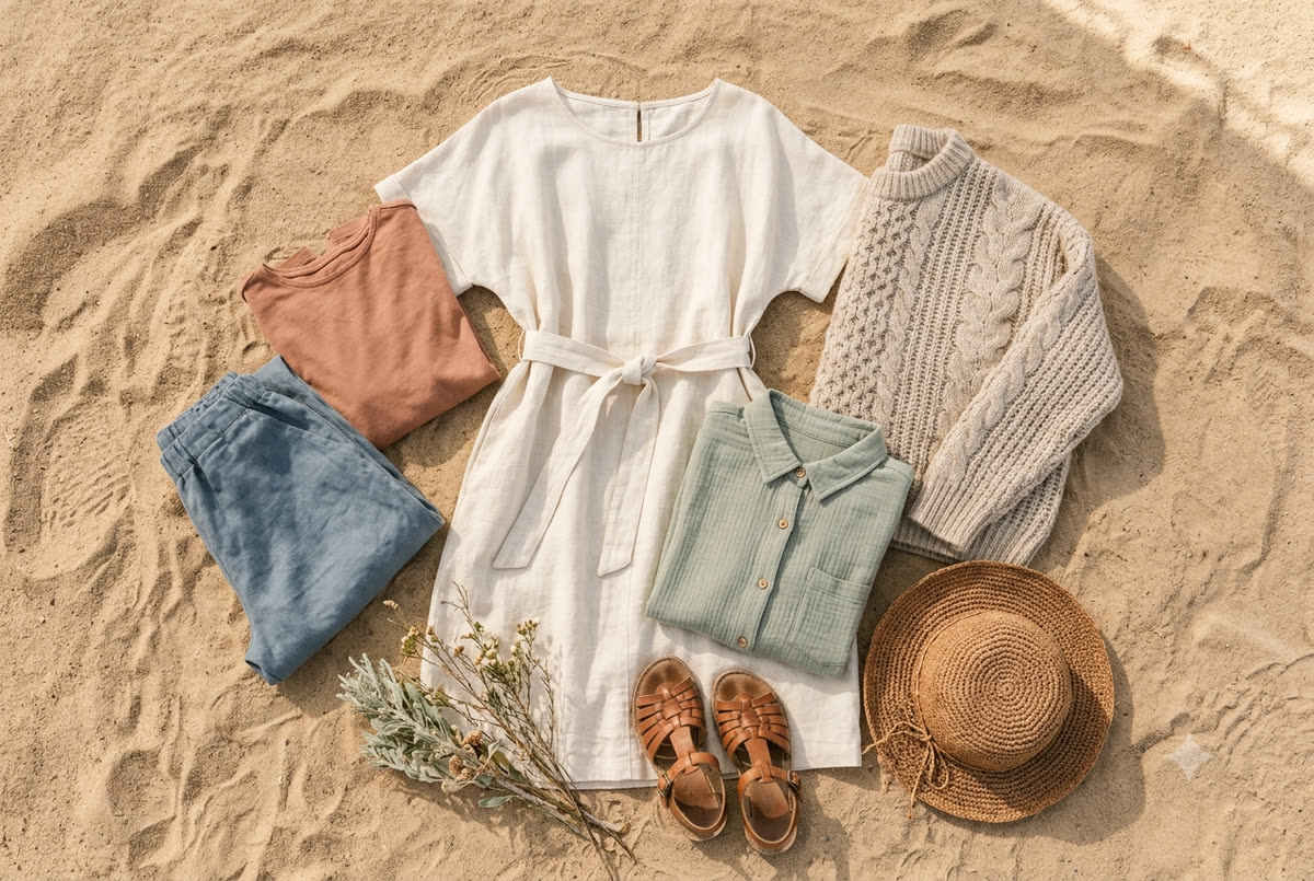
A palette I return to again and again for the desert: warm neutrals built around the landscape itself. Cream, oatmeal, soft camel, terracotta, dusty sage, a muted blue like the early-morning sky over the Santa Rosa Mountains. These tones live in harmony with our desert light, with garden greens and pale stone, with the warm earth all around us, so the family looks like they belong in the frame rather than pasted onto it. That is what gives portraits made here their timeless, honest feeling.
If you want a simple test, lay every planned outfit out on a bed, side by side, before anyone gets dressed. Step back. If your eye snags on one piece that feels louder or cooler or more saturated than everything else, that is the piece to swap. The bed test has saved more sessions than I can count.
How to coordinate without matching, step by step
This is the heart of it. Coordinating family photo outfits is really just layering a few simple techniques on top of your palette.
1. Vary the shades within each color
Instead of everyone in the same blue, spread across the family of that blue: navy, denim, slate, dusty powder. Same color family, different depths. This creates that gentle visual movement I mentioned and keeps the group from reading as a single flat shape. Think of it as one color performed in different octaves.
2. Let one or two people anchor, and the rest support
You do not want every single person in a bold pattern or a standout color, it becomes noise. Instead, pick one or two "anchor" pieces that carry the most visual interest, often what Mom is wearing, and dress everyone else in quieter supporting tones that complement it. The anchor gives the group a center of gravity. The supporting players make it feel calm.
3. Use texture to do the heavy lifting
This is the secret weapon, and it is especially lovely in the desert. When colors are kept in a tight, soft palette, texture becomes what gives a photo richness. Linen, chunky knits, suede, denim, lace, a wool fedora, a gauzy cotton dress, leather sandals, a cable-knit cardigan. All of these can live in the same cream-and-camel palette and yet feel layered and interesting because the materials catch light differently. A family in five shades of cream sounds boring on paper and looks extraordinary in person when the fabrics are varied. Texture is how you add interest without adding loud color.
4. Add pattern carefully, as a seasoning
Pattern is wonderful, but it is a seasoning, not the main dish. Limit yourself to one, maybe two patterned pieces across the whole family, and make sure the pattern's colors come from your existing palette. A small floral on a little girl's dress, a subtle stripe on a linen shirt, a gentle plaid. Keep the scale of patterns different from one another so two patterns near each other do not clash, a tiny floral can sit beside a wider stripe far more happily than two similar small prints. And pull a thread of color: if that floral has a dusty rose in it, you might echo that rose somewhere else in the group, on Mom's lipstick or a baby's headband, so the whole thing feels intentional.
5. Coordinate accessories and footwear too
The details finish the story. Hats, belts, shoes, jewelry, and even hair ribbons should belong to the same world. This is easy to overlook, and bright white sneakers on a child are the most common thing that quietly pulls a beautiful image apart. Lean toward neutral footwear, tan sandals, soft leather boots, bare feet on warm sand. In the desert, a good wide-brim hat is both a styling win and genuine sun protection, especially during our brighter months.
Dressing for the desert specifically
Everything above applies anywhere. But we are not photographing anywhere, we are photographing in the Coachella Valley, and the location should shape your choices.
Echo your setting. For an in-home session, your backdrop is your own light-filled rooms, the wood, linen, and warm wall tones you already live with. For a session at one of our local parks or gardens, it is green palms, dappled shade, pale stone, and big open sky. Either way, earthy, sun-warmed tones, terracotta, rust, ochre, olive, cream, dusty blue, melt into the scene beautifully, while cool, icy colors and bright primary brights tend to fight it. If you have ever wondered why some family photos here feel so effortlessly elegant, this is usually why: the family was dressed in conversation with the place.
Mind the season and the heat. Through our mild stretch from late fall into spring, the weather is gentle and you can layer freely, which is a gift because layers add texture and dimension. A light cardigan, a denim jacket, a scarf in cooler months all give me more to work with. In the summer heat, when we shoot at the very edges of the day to beat temperatures that climb past 110, lean into breathable natural fabrics, linen, cotton, gauze, and flowing silhouettes. Avoid anything tight or synthetic that will cling and wilt. You will be more comfortable and you will photograph better.
Watch how fabric moves. The desert almost always has a little breeze, and sometimes more than a little near the wind corridors out by Whitewater and the I-10. Flowing dresses, maxi skirts, and loose linen are not just comfortable, they are gorgeous in motion. A skirt catching the wind at golden hour in Rancho Mirage is one of my favorite things to photograph. Just be aware of it: if a breezy skirt is part of the plan, bring shorts or fitted leggings to wear underneath so no one is fussing.
Think about light, not just color. In a home session we work with soft natural window light, which is forgiving and flatters almost everything; outdoors at golden hour the light turns warm and directional, making warm tones glow while very cool tones can look slightly off. Either way, strong light pushes very dark or very bright solids to their extremes. When in doubt, mid-tones and softer colors are the safest, most flattering choice.
For more on timing all of this, my guide to planning a family photo session in the desert walks through seasons and golden hour in detail, and it pairs naturally with everything here.
Coordinating across generations and large groups
Coordinating gets more interesting, and a little more strategic, when the group grows. Multi-generational sessions are some of my very favorite work, especially when families gather here during the holidays, and outfits are where they most often need a steady hand.
The trick is to let the palette stretch across ages without forcing anyone into a look that is not them. Grandpa is not going to feel like himself in a trendy mustard linen shirt, and he should not have to. Put him in a classic chambray or a soft olive that lives in your palette, and let the younger members carry the more current pieces. A grandmother might wear an elegant flowing dress in your anchor color while the teenagers wear more relaxed, textured separates. Everyone draws from the same well, everyone looks like themselves, and the photo holds together because the colors agree even when the styles do not.
For bigger groups, simplify ruthlessly. The more people in the frame, the tighter your palette should be, because more bodies means more chances for one loud piece to disrupt the whole. Three or four people can support a slightly richer mix; twelve people at a family reunion need a calm, disciplined palette of just two or three tones. If you are coordinating a crowd, my notes on coordinating large group family photos go deeper on the logistics of keeping a big group cohesive.
A gentle tip for organizing the troops: rather than texting everyone "wear earth tones" and hoping for the best, share a small visual board. A few reference photos and a row of color swatches does more than a hundred words. People dress far more confidently when they can see the target.
Common mistakes I gently steer families away from
After many sessions, the same handful of stumbles come up again and again. None of them are disasters, and all of them are easy to avoid once you know to look.
- Logos and big graphics. A cartoon character or a brand name across a shirt dates a photo instantly and pulls the eye. Keep clothing clean and timeless.
- Brand-new bright white sneakers. They glow in our light and shout from the bottom of the frame. Choose neutral or worn-in footwear instead.
- Neon and highly saturated brights. They reflect their color onto skin, especially under strong sun, and overwhelm a soft palette. Save them for another day.
- Everyone in the exact same shade. The matching trap. Vary your shades within each color.
- All solids, no texture. Without texture or a touch of pattern, a tight palette can fall flat. Add knits, linen, and layers.
- Too many patterns at once. One or two, drawn from your palette, with different scales. More than that and the eye does not know where to land.
- Forgetting the baby or the teenager. It is easy to perfect Mom and Dad's outfits and dress the youngest in whatever is clean. Coordinate every single person, head to toe.
- Stiff, brand-new clothes no one has worn. If an outfit is uncomfortable or itchy, it shows on faces. Do a trial wear, and make sure kids can move and play.
A simple way to put it all together
If this feels like a lot, here is the short version you can hold onto. Choose two or three soft, earthy colors plus a neutral. Pull from the desert's own palette, creams, camels, terracotta, sage, dusty blue. Dress one or two people as anchors and everyone else in quieter supporting tones. Lean hard on texture and let pattern be a light seasoning. Coordinate shoes, hats, and accessories into the same world. Lay it all out on the bed and swap anything that jumps. Then stop fussing, because at that point the hard work is done.
And please remember the most important thing of all: the outfits are the frame, not the picture. The picture is your family. The way your daughter tucks into your side, the laugh you and your partner share when the kids go sideways, the quiet pride on a grandparent's face. I will be watching for all of it. The clothes just need to get out of the way and let those moments shine, and coordinating thoughtfully, rather than matching rigidly, is exactly how they do.
If you would like help thinking through your own palette before your session, that conversation is one of my favorite parts of the process, and I am always happy to have it. When you are ready, reach out and say hello. I would love to hear about your family and help you plan a session here in the desert that looks and feels like you.