Color Palettes for Desert Family Photos
A week or two before a session, my inbox usually fills with a flurry of texts that all circle the same worry: "What on earth should we wear — and please don't let us clash." I always smile, because the colors a family chooses do more to shape the feeling of their portraits than almost anything else within their control. It's the part of the planning I most love helping with.
Most of my sessions happen in the places where families actually live their lives — at home in the soft window light of a living room, on a back patio, or out together at a favorite local park or garden in Palm Desert, Rancho Mirage, La Quinta, and across the Coachella Valley. Those familiar settings are where families relax and look most like themselves, and a thoughtful color palette is the quiet secret that ties it all together. It's not about everyone matching. It's about everyone belonging — to each other and to the space you're in. Let me walk you through exactly how I think about it, so that when you open your closet, you'll feel certain instead of overwhelmed.
Why color matters more than the clothes themselves
Here's the honest truth: I almost never remember what a family was wearing when I look back at a favorite photograph. I remember how it felt. Warm and golden. Soft and timeless. Joyful and bright. That feeling is created largely by your color palette working in harmony with the environment.
When colors are chosen well, your eye goes straight to the faces — to your daughter's laugh, to the way your husband's hand rests on your shoulder, to your toddler's wild curls catching the last sun of the day. When colors are chosen poorly, your eye snags on a neon logo, a jarring bright red sweater, or one person who looks like they wandered in from a different photoshoot. The right palette makes everyone look like a unit and lets the people be the subject.
This is the heart of what I tell every family: think of yourselves as one bouquet, not a row of identical flowers — related tones that clearly belong together, never carbon copies. We'll come back to that idea often.
Start with the desert itself
The single most useful thing I can tell you is this: let the landscape be your guide. We are not photographing in a green New England forest or against a moody gray coastline. We're in the Coachella Valley, and our backdrop has its own distinct, beautiful color story:
- Sand and stone — warm tans, soft beiges, pale gold
- Desert plant life — sage green, dusty olive, muted gray-green
- The mountains — the Santa Rosas and San Jacintos shifting from purple-blue to rose at golden hour
- The sky — that impossibly clean, deep desert blue, and the peach-and-lavender wash of sunset
- Architecture — the white stucco and warm adobe of Palm Springs and Palm Desert, the deep greens of a manicured resort lawn in Indian Wells
A palette that echoes these tones will always feel at home. A palette that fights them will always feel a little off, no matter how nice the individual outfits are. This is why, here in the desert, earth tones and soft, sun-washed colors are nearly foolproof. They were practically designed for this light.
My go-to color palettes for desert families
Let me give you concrete, ready-to-use palettes. Pick one and build every family member's outfit from within it. You don't need all the colors in every outfit — think of these as a set of crayons you're allowed to draw from.
1. Warm Neutrals (my most-requested, and for good reason)
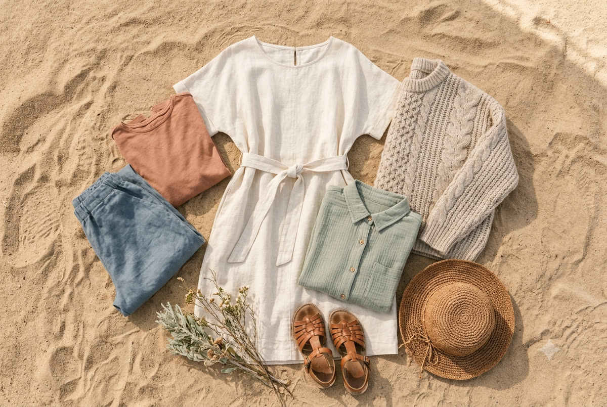
Cream, ivory, oatmeal, soft tan, camel, warm white, and gentle browns. This is the palette that looks the most timeless and the most "expensive," and it glows in our golden-hour light. It photographs beautifully against sand, rock, and the white walls of a Palm Springs courtyard. Add subtle texture — a chunky knit, a linen shirt, a flowing cream dress — so the photos still feel rich rather than flat. This is the safest, most flattering choice I can recommend for almost any desert family.
2. Desert Sunset
Terracotta, rust, dusty rose, muted mustard, warm peach, and soft clay. These are the colors of the canyon walls and the sky at the end of the day. They're warm, romantic, and they make skin tones look healthy and lit-from-within. A mom in a flowing rust or terracotta dress is, hands down, one of the most reliably stunning looks I photograph out here.
3. Sage & Sand
Soft sage green, dusty olive, taupe, oatmeal, and warm white. This palette borrows directly from our native desert plants and reads as calm, organic, and current without ever looking trendy in a way that will date your photos. It's especially lovely for families who want something a touch cooler than the sunset tones but still grounded in the landscape.
4. Soft Desert Blues
Dusty slate blue, faded denim, chambray, with cream and tan as anchors. The key word is muted — think the color of the mountains in late afternoon, not a primary royal blue. This is a wonderful option for families who genuinely don't feel like themselves in earth tones. Pair it heavily with neutrals so it stays soft.
5. Plum & Mauve (a beautiful cool-season choice)
Mauve, dusty plum, mushroom gray, soft lavender, and taupe. As the light cools a little in our winter months, these gentle berry-and-gray tones feel elegant and seasonal. They flatter a wide range of skin tones and look gorgeous against both the mountains and a shaded garden setting.
How to build outfits within a palette
Once you've chosen a palette, here's the simple framework I give families so no one has to overthink it:
- Dress the hardest person first. Usually that's Mom (because she's most particular about how she looks and feels — and that's completely fair) or a strong-willed little one. Find one piece you genuinely love and feel beautiful in, then build everyone else around it.
- Pull two or three colors from your palette and distribute them across the family. If Mom is in a terracotta dress, Dad might wear a cream or oatmeal shirt, one child in soft tan, another in dusty rose. Everyone is drawing from the same box of crayons.
- Spread the colors around — don't cluster them. You don't want both parents in dark tones and both kids in light. Mix it up so the eye travels evenly across the group.
- Layer in texture and pattern carefully. A small, low-contrast pattern (a thin stripe, a subtle floral, a gentle plaid in your palette colors) can add life. The rule: only one or maybe two people in pattern, and keep it muted. Let everyone else stay solid.
- Mind the contrast level. Soft, low-contrast palettes (creams, tans, dusty tones) read as timeless and serene. Very high contrast (stark black with bright white) can feel harsher and pull focus. For desert family work, I almost always steer toward the soft, harmonious end.
Mistakes I gently steer families away from
I say all of this with love — I've seen these little stumbles a hundred times, and they're so easy to avoid once you know:
- Everyone in the identical outfit. Matching white shirts and jeans was a look once, but it flattens individuality and reads as dated. We want coordinated, not uniformed.
- One person in a wildly different color. That bright kelly-green polo or fire-engine-red dress will pull every eye, every time. If one outfit "pops" far more than the rest, it competes with your faces.
- Big logos, slogans, and licensed characters. A giant cartoon character or a brand logo across the chest instantly dates the photo and distracts. Keep clothing clean and simple.
- All-black or all-white head to toe. In our bright, warm light, head-to-toe black can feel heavy and can lose detail; pure stark white can glow too hot. A touch of either as an accent is lovely — just not the whole story.
- Neon and electric brights. They reflect onto skin (that green glow under the chin) and clash with the warm desert palette.
- Forgetting the little details. Bright sneakers, a neon hair tie, a cartoon backpack a toddler refuses to put down. These small things show up more than you'd expect. I always suggest doing a quick "head to toe" check on each person.
Choosing colors for your skin tones and the season
A few extra considerations that make a real difference here in the valley:
Work with your family's coloring. Warm earth tones — terracotta, camel, olive, cream — are flattering on the broadest range of skin tones, which is part of why I recommend them so often. If your family has cooler complexions and you tend to look washed out in tan, the soft blues, mauves, and plums will likely feel more like you.
Think about the season we're shooting in. In our cooler months, the plum-and-mauve and sage palettes feel especially seasonal, and you can layer in cozy texture like light knits and scarves without anyone overheating — lovely for a session at home or on a shaded patio. When the weather warms up, breathable linens and flowing fabrics in creams and sunset tones keep everyone comfortable and looking effortless; if we're outdoors in a park or garden, we'll simply lean into early-morning or golden-hour timing so the light stays soft and the heat stays gentle.
Consider your home, if that's where the photos will live. If your living room is full of cool grays and blues, an all-terracotta gallery wall might feel disconnected hanging there. It's a small thing, but choosing a palette that complements where the prints will actually live is a lovely, thoughtful touch.
Where we're shooting matters too
The setting shapes the palette as much as the season does. Most of my families choose somewhere close and familiar, and each spot has its own sweet spot:
- In your own home — the bright, soft window light of a living room or bedroom is endlessly flattering, and it's my favorite place to photograph families. Here the palette gets to harmonize with your room: warm neutrals, sage, and gentle sunset tones glow against most interiors, and it's worth a quick glance at your walls and sofa so nothing fights the space.
- A back patio or courtyard — those clean white-stucco walls and pops of architectural color love a crisp, simple palette: cream, soft denim, a little terracotta.
- A local park, garden, or green resort lawn in Indian Wells or Rancho Mirage — sage, cream, and soft blues sit beautifully against the green, while rust and mustard create a gorgeous complementary warmth. Late afternoon into golden hour is when these spots look their absolute best.
- A scenic desert overlook near La Quinta or Indio, if you're drawn to that wide-open backdrop — lean fully into the warm earth tones and let that low, honey-colored golden-hour light do the work.
If you're not sure where we'll be, don't worry — we'll talk through your location when you book, and I'll tailor my palette suggestions to the exact spot and time of day. That conversation is part of how I make sure your session feels easy and you.
A simple way to test your palette before the session
Here's a trick I love: lay all the outfits out together on a bed, or even just gather the pieces and photograph them as a flat-lay on your phone. Looking at them side by side — and especially looking at the photo of them — tells you instantly whether something is fighting the group. If one piece jumps out, swap it. If it all settles into a harmonious whole, you're ready. Snap that picture and text it to me if you'd like a second pair of eyes; I'm always happy to help.
The bigger picture
Choosing a color palette isn't really about rules — it's about creating a cohesive frame so that the truest, warmest version of your family can shine through. When the colors are right, you stop thinking about the clothes entirely. You just get to be together, and I get to do what I love most: catching the small, honest in-between moments that make your family unmistakably yours.
If you'd like to go deeper, I've written more on dressing your littlest ones in what to wear for desert family photos with young children, on the best times of year for Coachella Valley family sessions, and on making the most of desert golden hour. Each one builds on the ideas here.
And if you're starting to picture your own family — gathered in your living room, on the patio, or under the trees at a favorite park — tell me about them. Send me a note with a little about your crew and the kind of feeling you're hoping to capture, and I'll help you land on colors that suit your family and your space beautifully. You can get in touch with me here. I'd love to start planning with you.